02. Non-Positional Encodings for Third Variables
L5 021 Non Positional Encodings For Third Variables V1
DataVis L5C02 V3
Non-Positional Encodings for Third Variables
There are four major cases to consider when we want to plot three variables together:
- three numeric variables
- two numeric variables and one categorical variable
- one numeric variable and two categorical variables
- three categorical variables
If we have at least two numeric variables, as in the first two cases, one common method for depicting the data is by using a scatterplot to encode two of the numeric variables, then using a non-positional encoding on the points to convey the value on the third variable, whether numeric or categorical. (You will see additional techniques later in the lesson that can also be applied to the other two cases, i.e. where we have at least two categorical variables.)
Three main non-positional encodings stand out: shape, size, and color. For Matplotlib and Seaborn, color is the easiest of these three encodings to apply for a third variable. Color can be used to encode both qualitative and quantitative data, with different types of color palettes used for different use cases. Because of how broadly color can be used, a dedicated discussion of color and its use in Matplotlib and Seaborn will be deferred to the next page in the lesson.
Encoding via Shape
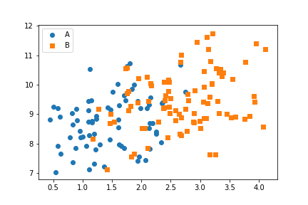
Shape is a good encoding for categorical variables, using one shape for each level of the categorical variable. Unfortunately, there is no built-in way to automatically assign different shapes in a single call of the scatter or regplot function. Instead, we need to write a loop to call our plotting function multiple times, isolating data points by categorical level and setting a different "marker" argument value for each one.
cat_markers = [['A', 'o'],
               ['B', 's']]

for cat, marker in cat_markers:
    df_cat = df[df['cat_var1'] == cat]
    plt.scatter(data = df_cat, x = 'num_var1', y = 'num_var2', marker = marker)
plt.legend(['A','B'])
The 'o' string specifies circular markers for members of category 'A', while the 's' string specifies square markers for members of category 'B'. The legend function adds a legend to the plot, with one marker for every scatter call made. The function argument sets the labels for those points.
(Documentation: matplotlib built-in markers, marker reference example)

From the positional encodings in the plot, you can see that there is a modest positive relationship between the two numeric variables. Adding the categorical variable via shape encoding, we can see that points of category 'A' tend to be smaller than those of category 'B' in terms of the numeric x-variable ("num_var1"). Neither category seems to have an advantage in terms of variability or value for the numeric y-variable ("num_var2").
Note that the two categories have automatically been double-encoded with different colors, in addition to the explicitly specified markers. If we wanted the points to have the same color as well, we could do that through the "c" parameter in scatter or "color" in regplot. A small example of where this is useful will be seen in the next section.
Encoding via Size
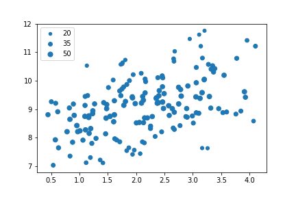
Point size is a good encoding for numeric variables. Usually, we want the numeric values to be proportional to the area of the point markers; this is the default functionality of the "s" parameter in scatter. (You need to refer to "s" through a dictionary assigned to the "scatter_kws" parameter when working with regplot.)
plt.scatter(data = df, x = 'num_var1', y = 'num_var2', s = 'num_var3')

# dummy series for adding legend
sizes = [20, 35, 50]
base_color = sb.color_palette()[0]
legend_obj = []
for s in sizes:
    legend_obj.append(plt.scatter([], [], s = s, color = base_color))
plt.legend(legend_obj, sizes)
While the creation of the plot is easier with size, we need to put in extra leg work to create a legend. Since, as noted above, legend will only create one legend entry per plot function call, we need to create additional dummy scatter objects with reference sizes to create the plot. The color is fixed so that all of the legend entries have the same color, and two arguments are provided to the legend function: the list of plotting objects to depict in the legend, and their labels.

The size encoding for the third numeric variable ("num_var3") shows that its values are largest in the 'middle' of the distribution of values, and smaller on the upper and bottom edges. It is also clear that size is much less precise an encoding than position, so it is better used to make general, qualitative judgments than precise judgments.
In the case of the example, the data was also scaled in a way that the marker sizes made sense as given. You might need to apply a scaling factor (e.g., multiplying or dividing all values by 2) or shift in order to make the size encoding interpretable. In particular, if the values in your third numeric variable include negative values, then you might want to choose a color encoding instead.
A Warning on Combining Encodings
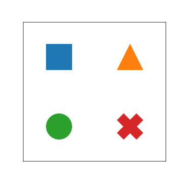
It might seem plausible to combine both size and shape encodings into the same plot, to depict the trend in four variables at once. Technically, this may be true, but there are some cautions to be taken with this approach. One surface issue is that the code to depict the plot and a reasonable legend gets complicated. A more important issue is that point areas won't all be the same even with the same value, depending on the shape of the marker:
plt.figure(figsize = [5,5])

common_size = 2500
plt.scatter([0],[1], marker = 's', s = common_size)
plt.scatter([1],[1], marker = '^', s = common_size)
plt.scatter([0],[0], marker = 'o', s = common_size)
plt.scatter([1],[0], marker = 'X', s = common_size)

# a little bit of aesthetic cleaning
plt.xlim(-0.5,1.5)
plt.xticks([])
plt.ylim(-0.5,1.5)
plt.yticks([])
Despite having the same "s" values, the triangle, circle, and X markers all look smaller (have a smaller area) than the square. Perhaps this isn't a major concern, considering that size is better used as a qualitative measure for exploration. But it's still something to consider. A little more discussion of the number of variables that can be reasonably packed into a plot can be found later in the lesson ("How much is too much?").
Further Reading
- Bloomberg: Tracking Super Bowl Ticket Prices - This visualization shows an interesting encoding for a third variable: connecting points by a line to show the changes in the two axis values across time. A different marker at each end of the path shows the starting point and the end point.